Monday, October 5, 2009

"wish i could have stricken up a conversation"


I am glad that Piyu's love of craiglist introduced me to illustrator Sophie Blackall through her thusly themed blog. Some are more comical than others (I love the man in a purple shirt who was "having a bad day and looked offal [sic]"), but all have a sense of misty, aching regret.

See also I Saw You..., a similarly themed and lovely book collecting comics by a number of artists including a few other Brooklyn-based illustrators. On the whole it's more lighthearted but there are also some seriously sigh-inducing ones.

Sunday, October 4, 2009

don't push me around

Scott sent me this link the other night. What a strange little gem.

It makes me wonder who was sitting around taping San Diego public access back in 1977. Also makes me need to get out my Hofner.

Friday, October 2, 2009

a dandified hedonism


color memory - the beets, originally uploaded by mhipley.

Sarah and I went to Fette Sau tonight, and I am having a hard time feeling guilty for the indulgence of a relatively expensive night out. We ate an immense amount of food and drank enough to feel fuzzy and loud, but not so much of either that I feel more than a warmishness at the moment. Even the clarity of the solo bike ride home only made me feel even better about spending more money than I ought on one meal.

I was thinking again about Alex Kapranos's series about eating on tour and how it accumulates in his book into an ode to indulgences of quality. Everyone should have some stories about things getting out of hand, but it can also be lovely to take a night to push to that brink of climax and retreat with enough consciousness to remember the taste of the trip.

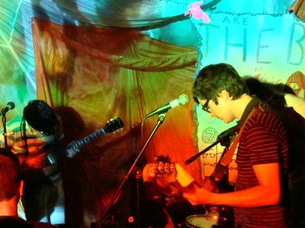
For my light and color class we had to make several sets of color swatches to try and capture a particular scene. After coloring a hundred variations on the grey and white classroom, I decided to base the "color memory" set on seeing the Beets with Carlos and Ari in June. The sway of the body heat and colored lights was something wonderful. I didn't capture it as well as I would have liked, but I enjoyed trying to get the exactly sickly shades of green and orange.

Sarah is preparing for grad school applications, take two, and we agreed it really comes down to committing to something wholeheartedly even if you are not sure that it's right. It's easier to change your mind later than it is to jump start your life with lukewarm intentions.

the beets, bruar falls, june 09

Monday, September 28, 2009

jump start yeah!


me on the train, originally uploaded by mhipley.

Tomorrow I am going to a panel after work about blogging and such so I figured I should get this thing going again. When I get my site up in the next few weeks, I'll either end up attaching this or something new to it, so I need to get in the habit.

I was kind of surprise given how anti-internet he is, but Carlos wants a blog for the site I am going to build for him as well.

Mostly I have been doing boring school exercises, but here is an unfinished drawing I started while riding on NJ Transit a few weekends ago. It was late and I was tired and about another hour and a half from my apartment.

Thursday, July 23, 2009

sketch-a-day #3: me vs. fruit


me vs. fruit, originally uploaded by mhipley.

Vegetables are not as much of a problem.

CONYEEZY INDUSTRIES

I finally finished the pokémon-inspired design I promised to my favorite nerdcore couple over at Conyeezy Industries. Here is a version where I played with the color a little to make it pop a bit more:

They are a rad couple making nerdtastic music (and with a little nerd baby on the way!) so check them out.

sketch-a-day #2


Okay, it's still the same month, so that counts right? I did this last night and already have today's planned, so hopefully I can have a 2-day record at least.

I am kind of frustrated with the layout of this blog, but I want to commit to posting in it more before I start messing with the settings.

Thursday, July 2, 2009

sketch-a-day #1

I've had this nice little moleskin for months and have barely used it, so I decided that I have to do at least one page a day every day from now on. Right now I am pretty motivated and tempted to draw more, but I want to save some of that commitment for tomorrow.

thanks to modern medicine

Here are some new and oldish things:


I kinda of want to add some color to the second, but I am not sure how. I drew it with marker on Bristol paper, so I could always go back and add a little watercolor, but I was also thinking of adding some color in Illustrator and giving it a screen printed effect kind of like Carlos' poster for Wavves:


I might be doing a new poster project soon. Need to make some calls and work out the details though.

Friday, June 26, 2009

up late

I am finally feeling like I am making some progress on some things. Here is a skull in progress for a project involving some grungy skulls:


Drew it, futzed with in in Photoshop, and then traced it in Illustrator. Too late to write much more now.

Wednesday, June 24, 2009

catching up

I am feeling super inspired of late and want to start doing this more frequently. I just got a package from Carlos that included some arty things. First, there was booklet from the Seattle-Tehran Poster Show that featured his No More Poster Giant protest poster:

I love love love his stuff, and it's so good to see it side by side with some other awesome designs. The Seattle end of the show ran last year from August 29 to September 1.

He also sent me a copy of Sketchbooks: The Hidden Art of Designers, Illustrators and Creatives. It looks amazing, and I can't wait to post more about it after I've had a chance to look through it.

I made a quick birthday card for a friend this Saturday and it went over so well I am thinking of doing a set of blank animal cards.

The original is watercolor and marker on Bristol paper, but if I were to do them as sets to sell, I think that might be too time consuming. If I can manage to get a quality medium format printer sometime soon, I could print them that way onto card stock from scans of the original pieces. I am also toying with the idea of screen or lino prints. As for selling, outside of friends and relations, I only want to sell over the internet. I am not a craft fair kind of person. So etsy or big cartel it is.

Thursday, May 14, 2009

Fashion gone awry (or "THAT'S RACIST")- a serious post.

Okay. So I thought it was pretty lame when American Apparel started carrying real live vintage items in their stores. I already have enough frustration in my life for the overpriced "thrift" stores that snatch up the best bets from the Salvation Armies and Goodwills of the world and resell them for more than it would cost to buy the brand new equivalent. I am all for nostalgia, but I am not going to pay more than I would for a new shirt for one that smells like my dead grandmother's closet. I also just think it is lazy design to literally repackage old stuff as your own. All I ever do as an artist/designer is steal from other people, but at least I have the courtesy to filter it through my own lens and make something new.

When I walked into the Scoop Men location in the meatpacking district (430 W. 14th St., New York, NY 10014) yesterday, I saw the sort of retro hipster stuff I have come to expect as the norm for NYC fashion. But Scoop Men is also selling used leather belts with new lacquered belt buckles featuring album covers and logos of 70's greats. I have been fixating on Out Of The Blue lately, so it caught my eye from a mile away and I had to investigate. At first I just thought it was a crime that Scoop was using the novelty of "vintage" to sell a shitty old belt for $300 to some dweeb who would probably only be able to name "Mr. Blue Sky" out of the ELO catalog and only under duress. And then I took a closer look at the belt itself:


Seriously, Scoop? Did no one in the process of this belt making it into the store kind of notice the Confederate flags all over it? This is New York, not Alabama, and I would have hoped that someone would have thought this was maybe a faux pas. I figured the odds of such an obscenely priced FAIL being sold were slim, so I came back today with a camera to document the disaster. Amirite?

Wednesday, April 22, 2009

Okay, I lied.

First another update- this one about my biggest project in the works.

I really need to get on the ball with the Sasquatch poster. I like what I've heard of The Pica Beats so far, and I'm crazy excited to get the chance to do a poster for them. The prospect of screen printing it is more than a little intimidating, but I am going to try and keep things relatively simple with just two colors. I want to give photo emulsion a try though, so I guess I'm going to be turning the bathroom into a darkroom for a day.

The general concept is still in flux, but my two main visual inspirations are the covers for a couple of my favorite EPs. I want to go for something slightly twee yet haunting, and so I immediately though of Belle & Sebastian's "3.. 6.. 9.. Seconds of Light" and My Bloody Valentine's "Glider."

No one writes about the woes of being an awkward teenage girl like Stuart Murdoch. I bought a reissue of this at about age 16, and I still remember all the words to "Le Pastie De La Bourgeoisie." The liner notes had an eerie little story about a boy in a copy shop that tied into the grainy, blown out photo on the cover. It's one of my favorite B&S covers still, and I wish I had my copy here with me in Brooklyn so I could reread the story now. I have some photos from some recent springtime adventures I might try playing with in Photoshop as such. I want to make a sort of damask and then use that as the first layer of color for the photo.

This EP was my introduction to My Bloody Valentine, and I listened to it compulsively. I love that the couple kissing on the cover is so distorted and abstract that it was only after many cumulative hours of staring at the cover that I realized what it was. I have a photo in mind that I want to work with to a similar effect for the top layer of color. I've been doing some stuff lately with using a lot of tiny lines. It makes my eyes spin, but I like how some of it has been turning out. I'm thinking big and abstracted with swirly text in a deep blue....

Here is a portrait I did recently using the kind of lines I am talking about. I did this drawing of my friend Jazz for a flyer but then ended up reworking it as desktop wallpaper for my laptop. All of the swirls were done in Illustrator though, and for the poster I want to sketch and ink everything by hand and then go to a copy shop to get it resized for the screen.


Okay, now I'm really off to vector some skulls.

REBOOT

Busy busy busy. I want to start using this again to keep track of projects and help me start thinking about how I want to set up my future portfolio site. So here are some updates.

I've been doing some stuff lately for this kid's concert series- NYC bands cleaning up their lyrics and playing matinee shows for hipster parents and their offspring. The first flyer was kind of maddening to pull together (series artist's block + being mad sick), but I think it came out okay.


The series is being sponsored by CMJ now too, so I did a quick banner ad for the upcoming show. It was kind of rad to see something I did (even if it is just a dinky banner) on a legit website.


I am trying to come up with some ideas for a permanent logo at that size for the CMJ site. I was playing with some Craig McCraken-ish ideas for the first flyer that I ended up discarding, but I want to try and revive those for this. Or something at least. I drew a little monster guy in my sketchbook who I think is pretty cute, but I haven't found a job for him yet.

But first- vectoring some sad skulls!

Saturday, January 31, 2009

Bad news, good news.

So I lost my café job. It is a bummer, but I will be able to scrape by for a while until I can at least find something part-time. I am not totally sold on another café job, but the hours were convenient. Except when they weren't. Having to get up at 5:45 every weekday morning was definitely a strain on my social life. I am also not too fond of being on my feet for eight hours straight or doing the same lame tasks ad nauseam. But this is why I am going back to school.

In awesome news, however, we finally got the new website up and running! aimeewilder.com is officially open for business. Buy some wallpaper or at least pass the link around. Fingers crossed!

Monday, January 19, 2009

I fail so hard at blogging. But at least it is because I have been crazy busy. Since my last post I got an awesome internship working with an amazing designer (Aimée Wilder), and that plus my regular job has been adding up to 12 hour work days. It's totally worth it though. I'm learning so much about both the design process and the business end of things. Aimée is so much fun to work with and is all about collaboration. It's so encouraging and inspiring. I can't wait until her new site is up and we can start selling wallpaper.

I've been trying to do a little freelance stuff on the side as well, but I've stopped hunting for jobs and have only done ones that have come to me (I don't really have the time for the craigslist scene and I don't want to get too bogged down).

Last week I did a flier for Jessie for her Slam Savannah project and another gig flier for Lieberman Management.

For the Slam Savannah flier I liked the action phrases of the copy Jessie sent me and wanted to make them really stand out. I thought about doing something playing off the word "slam," but then decided I wanted to do something more in an old school comic book style. I browsed around the internet looking at stuff like old Action Comics covers and some of the soap opera style newspaper comics (Mary Worth, Rex Morgan MD, etc.). I found some free fonts (DNW Comic Sans) and played around with some filters in Illustrator to get the Benday dot effect.

For the gig flier I ended up going with a similar vibe, but I did it in color and used vintage sewing patterns for inspiration. I was going for a 60s mod/psychedelic look and think it turned out okay. The lettering was a pain in the butt to do, but it was really the central focus of the flier so I couldn't skimp too much.

Now that I've finished both, I'm feeling a little listless, but I have so much to get done for my college applications I can't waste too much time taking a break.